Role: Mobile Designer (native iOS and Android), Iconography
Still somewhat available for download, but with many differences.
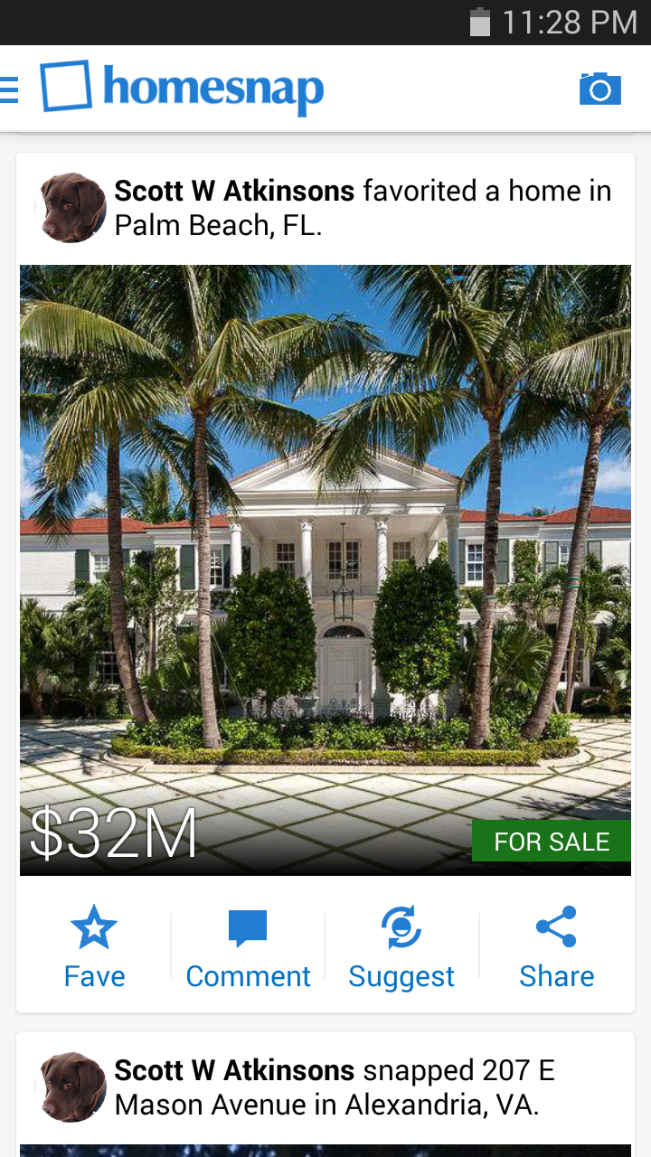
Because iOS and Android systems are set up differently, with separate ideas of what various visual tools mean, and audiences that are accustomed to different environments, I purposefully chose to handle each differently. Some are effects like image blurring or adaptive text sizing (which are significantly easier on iOS), and some are larger issues like how to best handle navigation with what's available. Overall, the brand remains consistent.
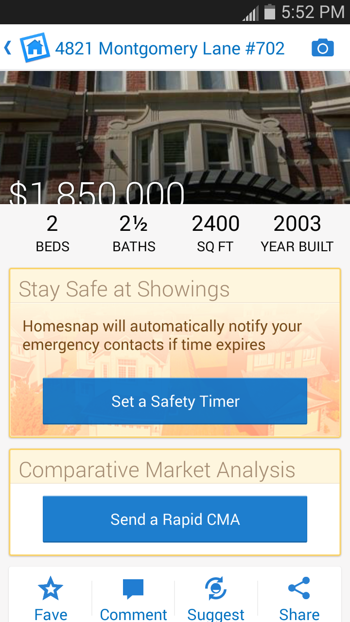
Below is the main attraction of the app: where all of the pertinent information is held and what we referred to as the endpoint. We went with a large image to begin with partially because it was the fad of the time, but also to have some sort of striking visual among what is generally just a huge block of data. Later, I liked the idea of a smaller image that you can make larger so that it's more apparent that there is information being loaded underneath, but the concept proved to be too taxing for the developers at the time.


Android Navigation
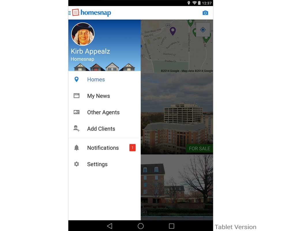
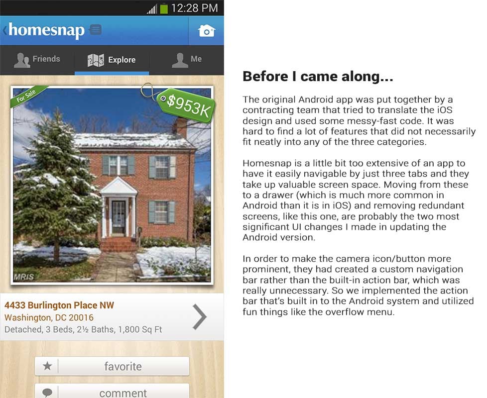
While iOS may have gotten more of a face lift for the big iOS7 release, the first few Android updates were closer to being an overhaul. Because most of the users and the people working at Homesnap all used Apple products, the Android platform hadn't gotten the attention it deserved. Being an Android user myself, this bothered me quite a bit and I was super excited when we were finally done with the iOS7 release and I could dig in to making it better!
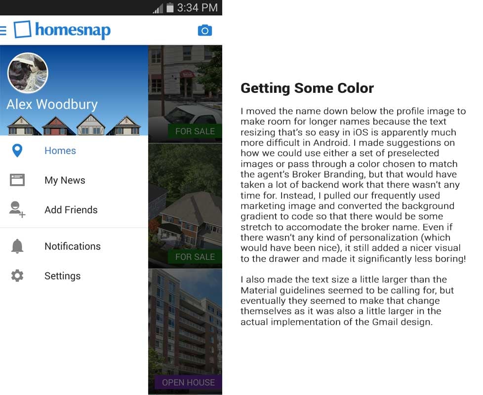
There were many changes; some were to modernize aesthetics but many were to clarify navigation and reduce redundancy. Here is the journey of the navigation drawer.


iOS Navigation
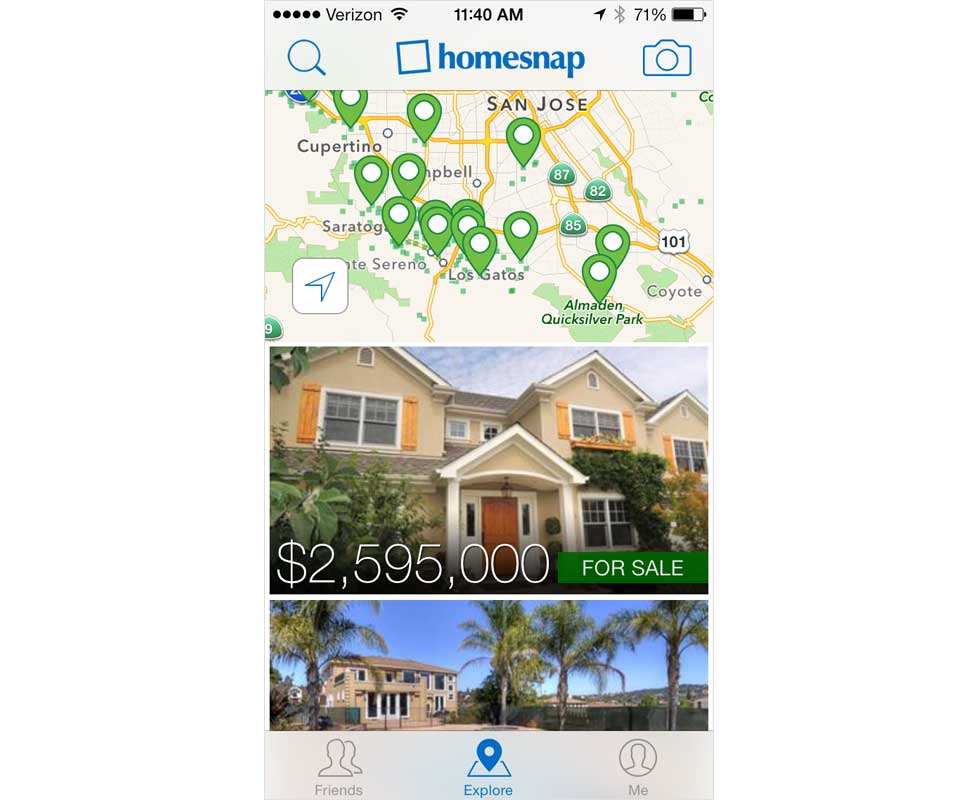
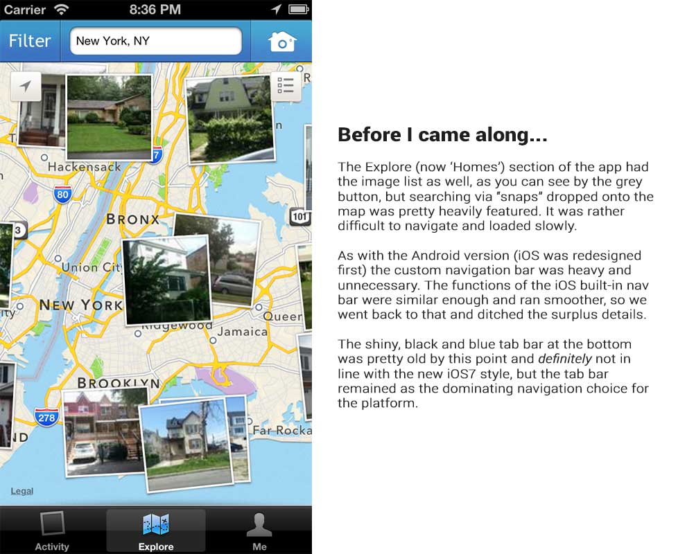
iOS didn't have nearly as many obvious changes as Android did, partially because it was kept more up-to-date. The majority of the work on iOS, as far as navigation is concerned, were cosmetic upgrades to "flat" design (though I'm not a fan of that term because overall it's not truly flat) and getting rid of the occasional redundancy.
Agent Features
Homesnap is a space where both real estate agents and house hunters can view a mix between public records and MLS data (Multiple Listing Service: database where agents share information about properties). Because an MLS shares some private information, certain things have always been restricted to agent accounts.
In order to carve out a niche from all of the real estate apps on the market, we began to make it a little more agent focused by providing special profiles, tools, branding space, and more. This was exciting for me since the reason I went to work for Homesnap is that my mother is an agent and the software she had available was always so awful (the best MLS in the country didn't even have mobile access) and I wanted to make it better!

Here, we have the agent profile as it can be seen by other agents. I'm showing what I think was a happy medium between what we had and where we should have been going that never got implemented, but you can find what I would have liked and what was actually current below.


